2026 Winner

SilverPackaging
BronzeBrand Identity
MAG mayonnaise
"Mag "
LG2
"Mag "
LG2
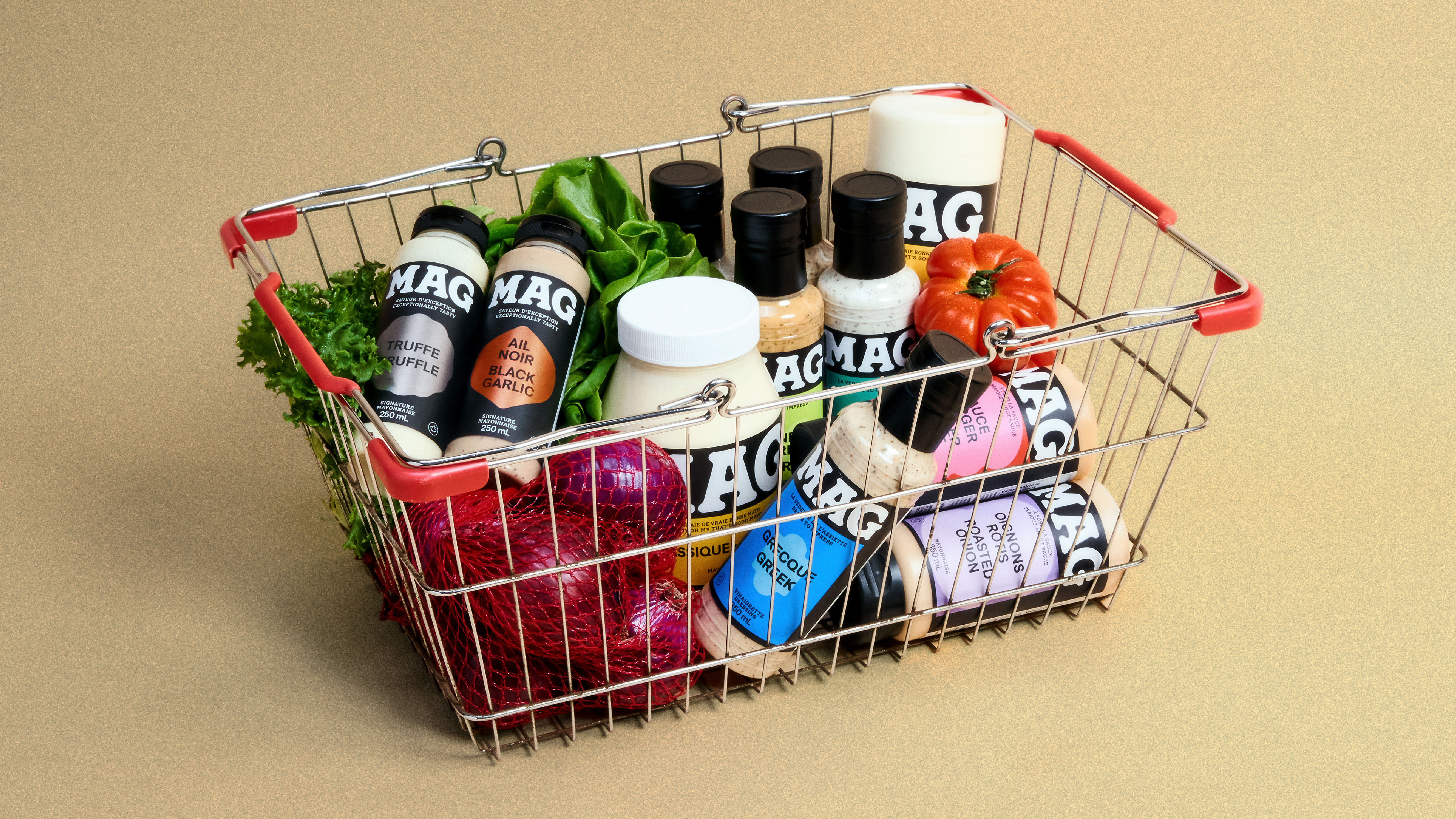
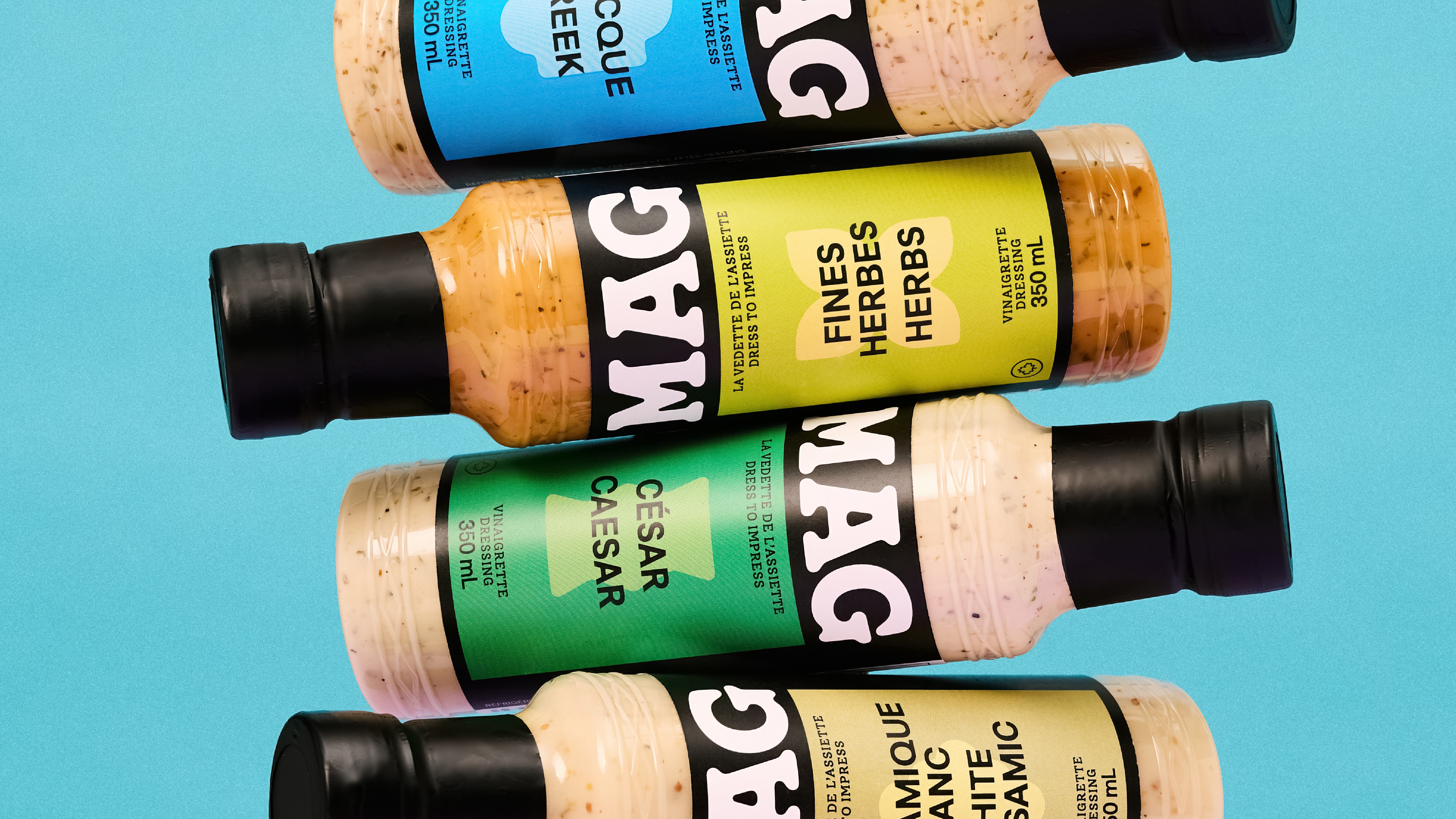
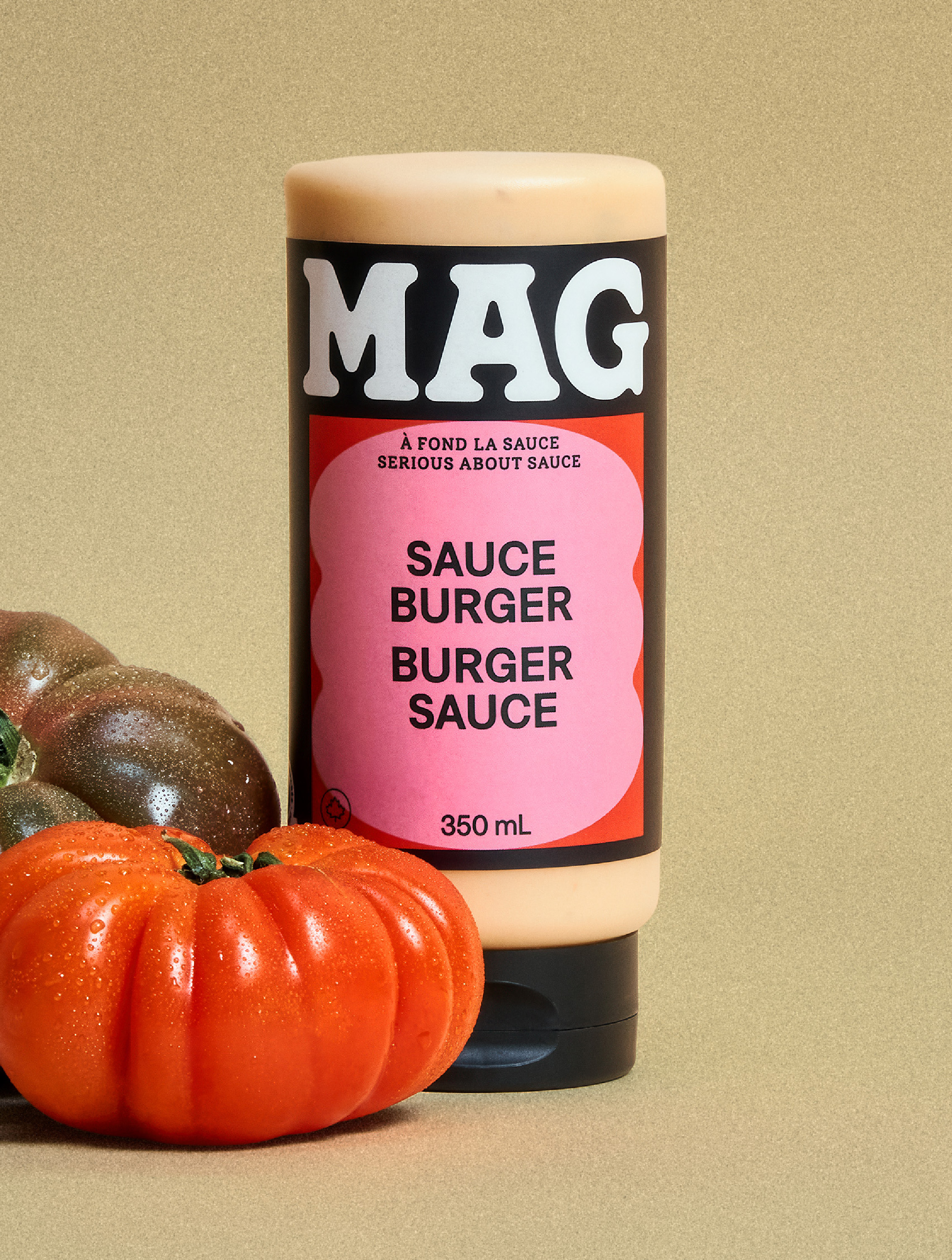
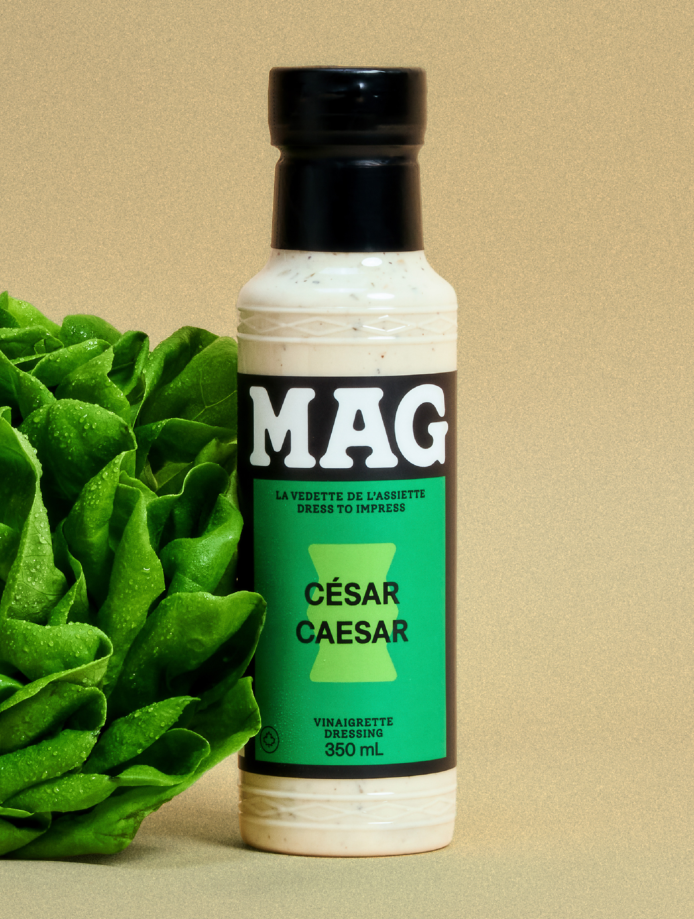
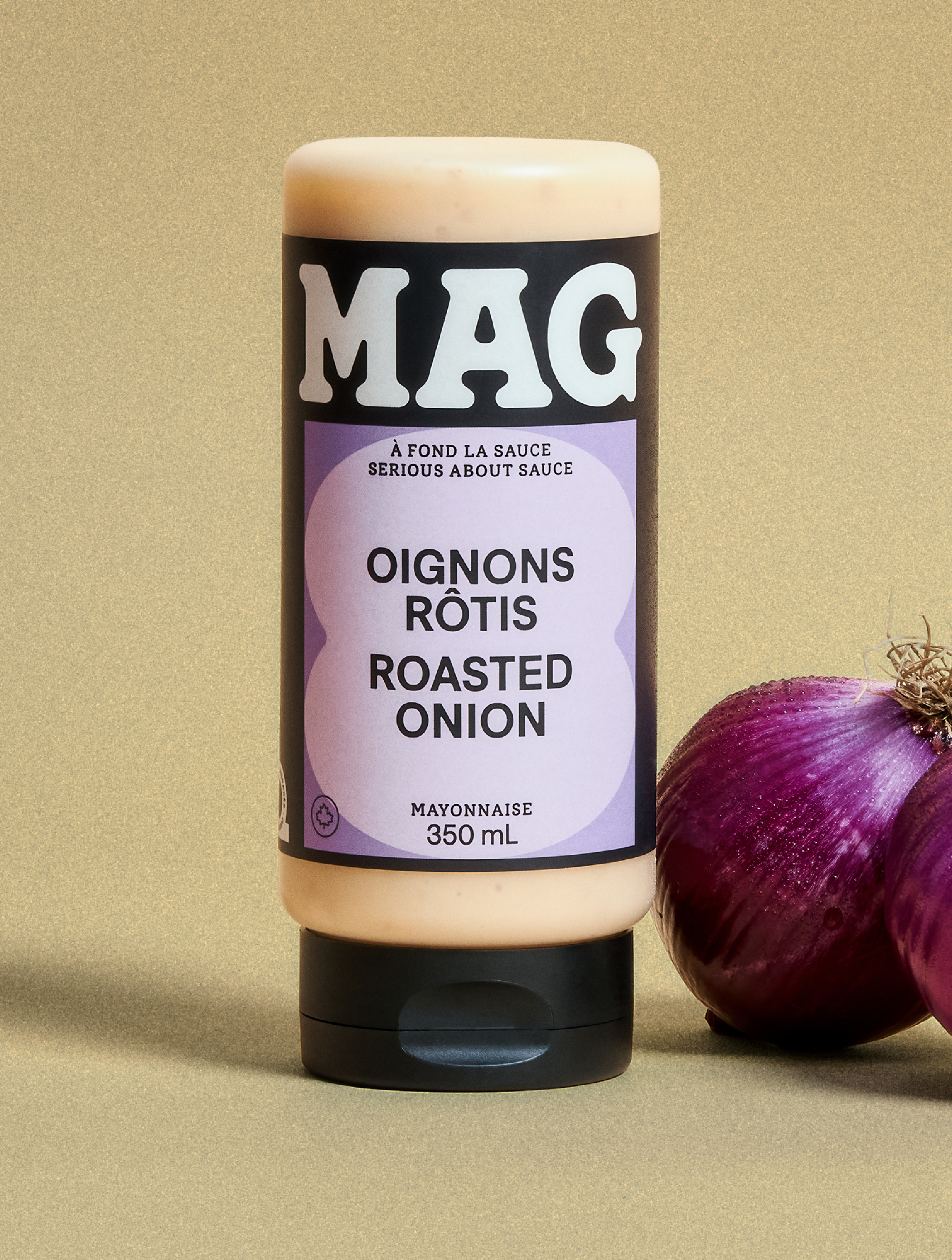
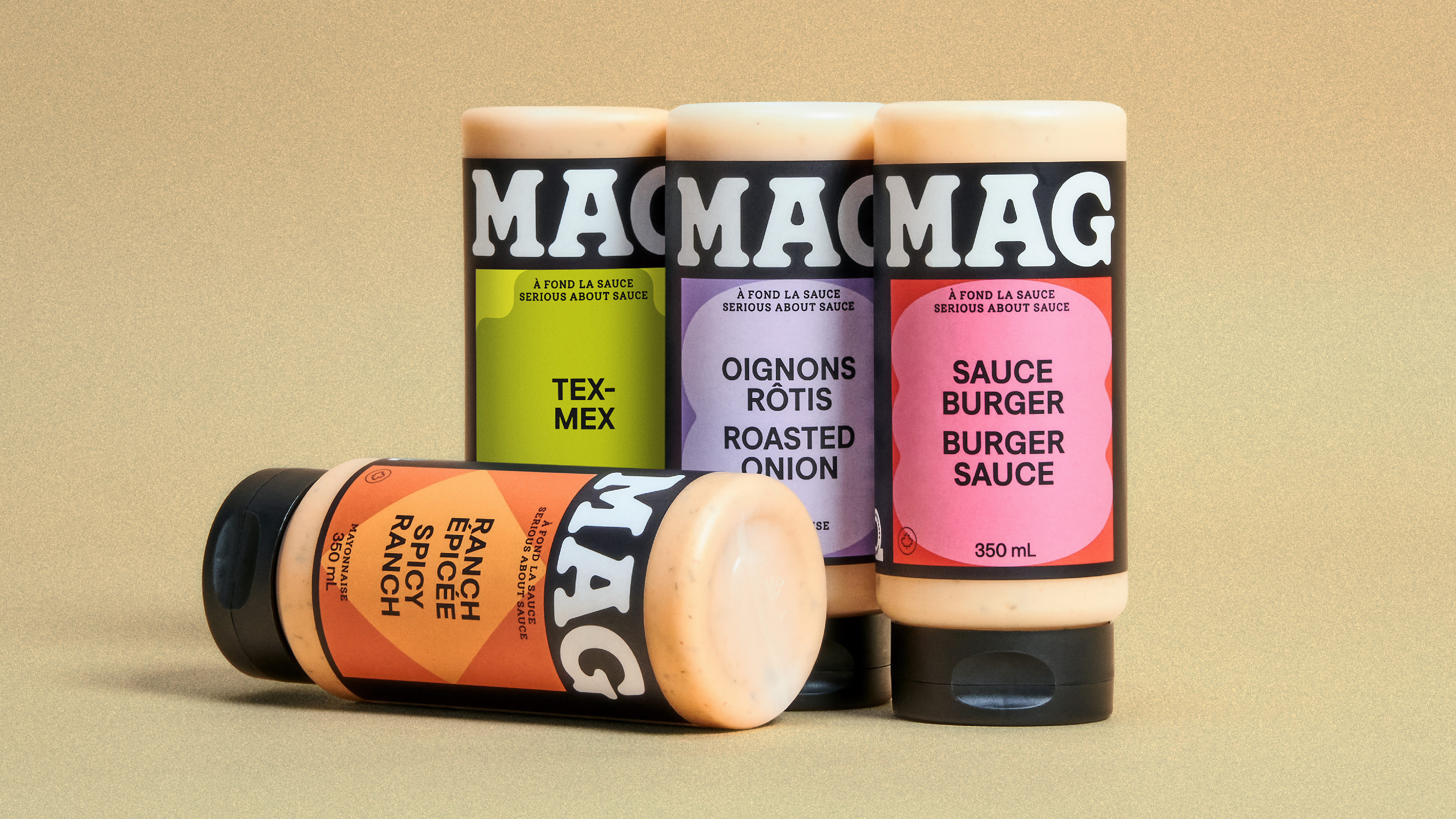
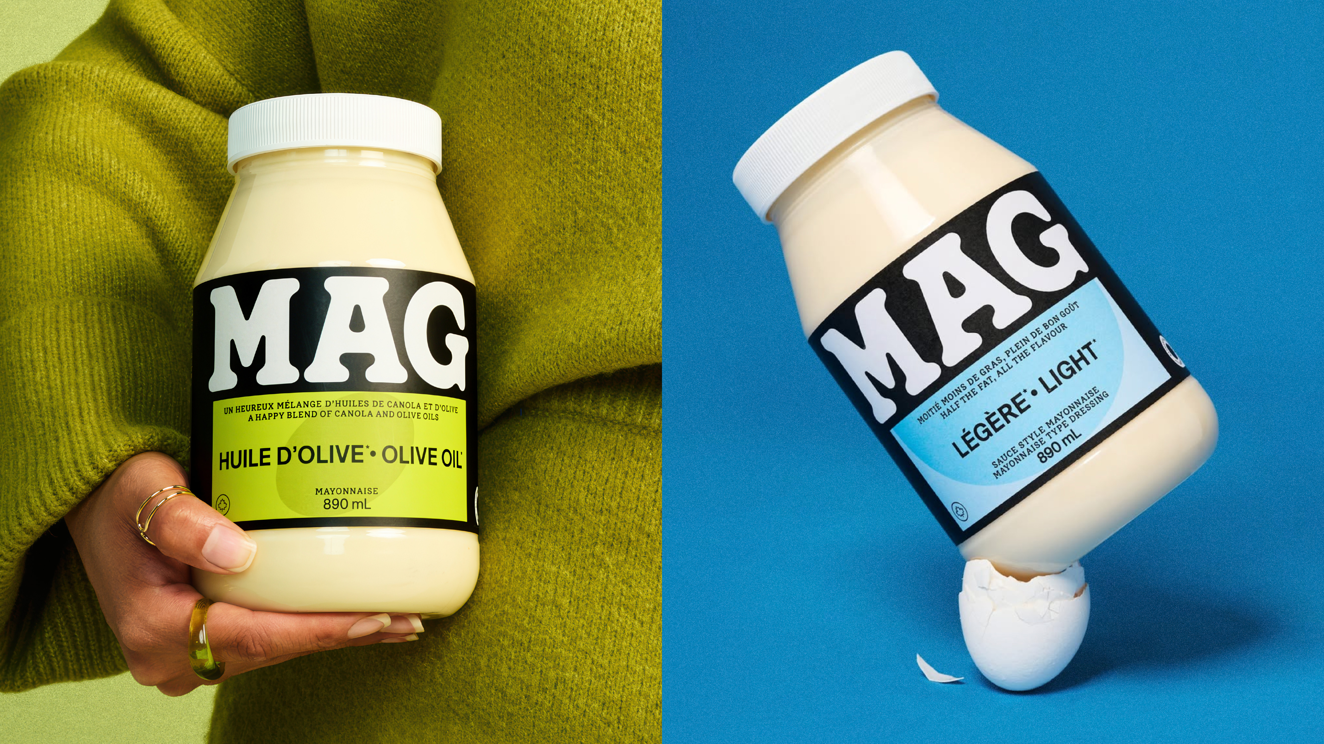
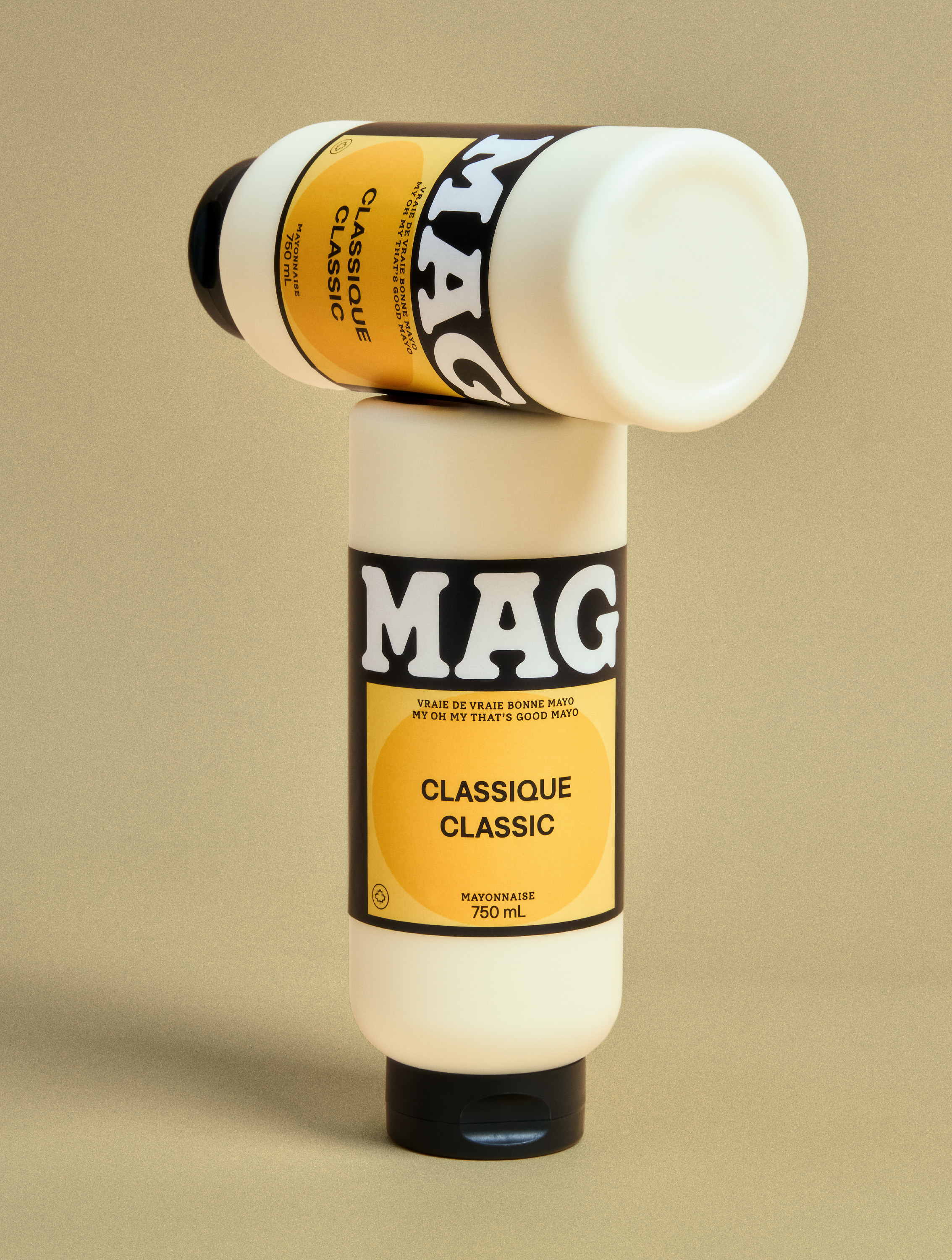
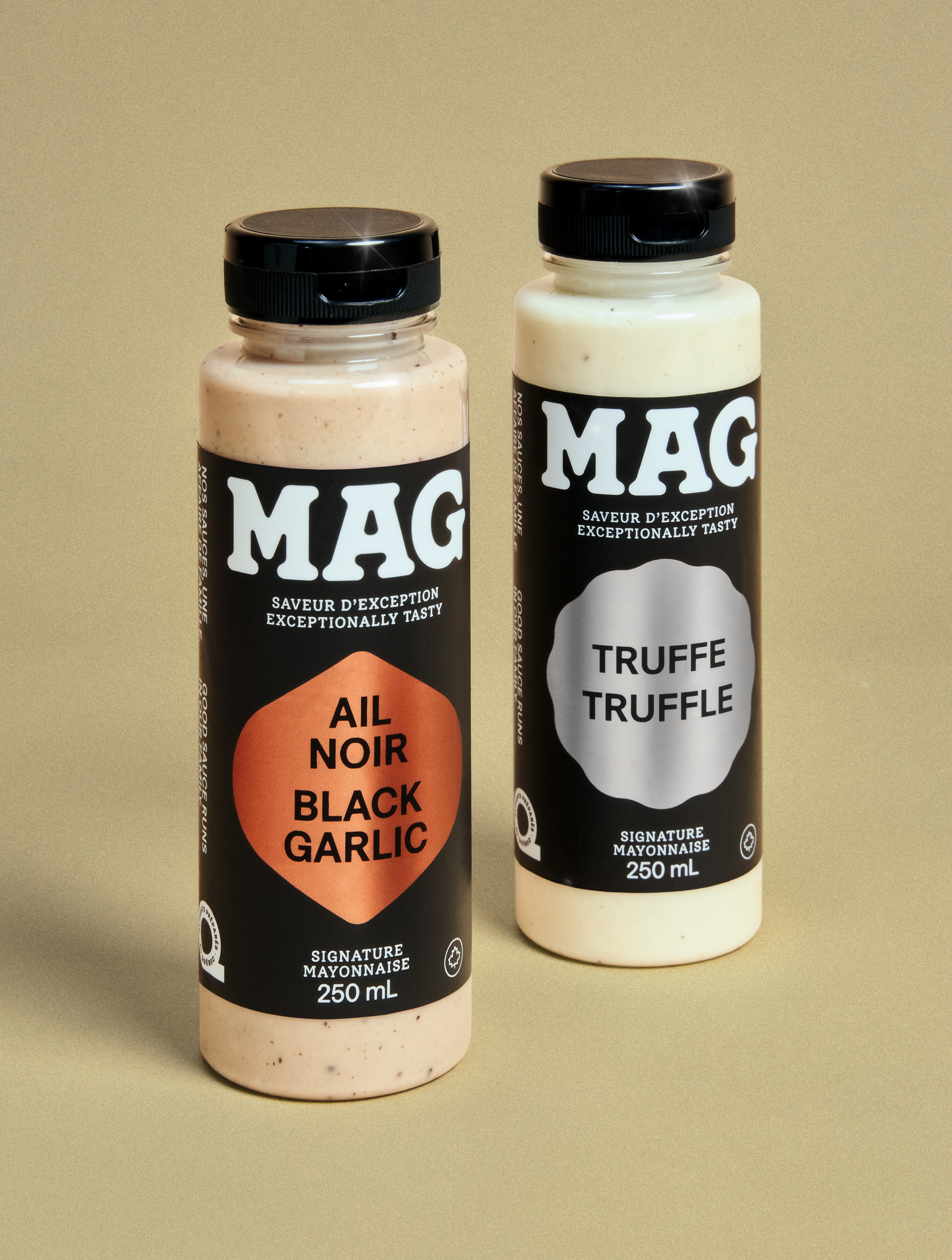
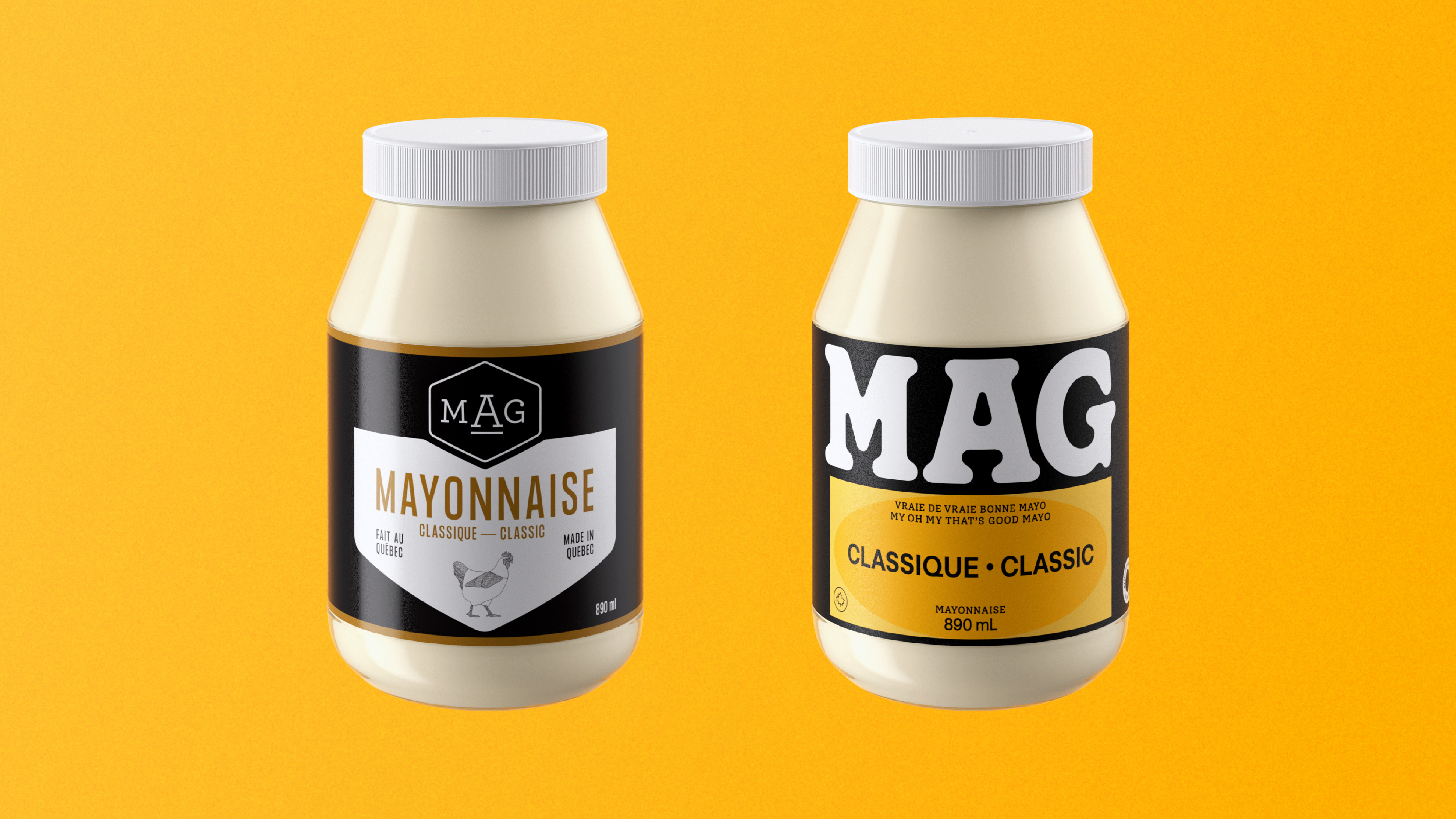
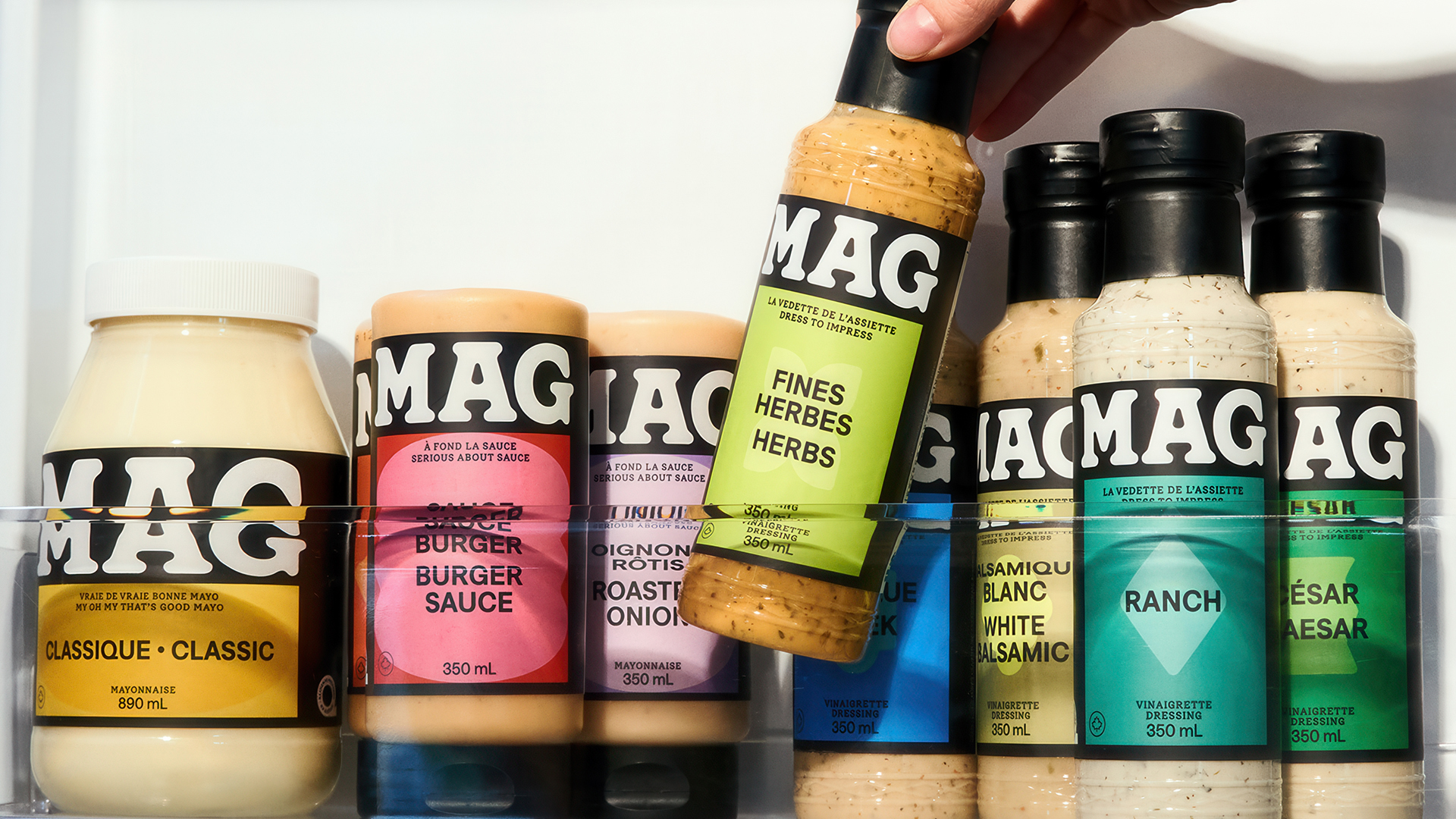
MAG wanted to refresh its packaging to support a move into retail and better showcase the quality of its products. The new identity centred on a bold, custom wordmark with rounded, “gloopy” letterforms that echo the texture of mayonnaise, using white all-caps to create a highly recognizable, product-driven logo. Designed for shelf impact, the logo is given prominence, while a flexible graphic system differentiates flavours through organic, variant-specific shapes and distinct copywriting for each line. The redesign helped position MAG as a credible challenger in the category, driving measurable growth: shelf velocity doubled, sales increased 160% year-over-year in 2025 and the brand reached 49% assisted awareness in Quebec.
Credits
[Company Credits]CREATIVE AGENCY: LG2
CLIENT: MAG mayonnaise
[Individual Credits - Agency - LG2]
CREATIVE DIRECTION: Anthony Verge
COPYWRITING : Béatrice Lachance
DESIGN: Nicolas Poulin
STRATEGIC PLANNING: Alexandre Normand
CLIENT SERVICES: Marilyne Beaudoin, Frédérique Morel
MOTION DESIGN: Daniel Martinez-Mendoza
GRAPHIC PRODUCTION: Sylvain Grégoire
PHOTOGRAPHY: Marie Desneiges Magnan
ILLUSTRATION: Maude Martel / Donna Doré
CHIEF CREATIVE OFFICERS: Josh Stein, Nicolas Baldovini, Luc Du Sault
CHIEF STRATEGY OFFICER: Sophie-Annick Vallée
VICE-PRESIDENT, EXECUTIVE CREATIVE DIRECTION: Nicolas Boisvert