2025 Winner


GoldTypography
SilverBrochures/Print Collateral
StopGap Foundation
"The Inaccessible Font"
Mekanism
"The Inaccessible Font"
Mekanism
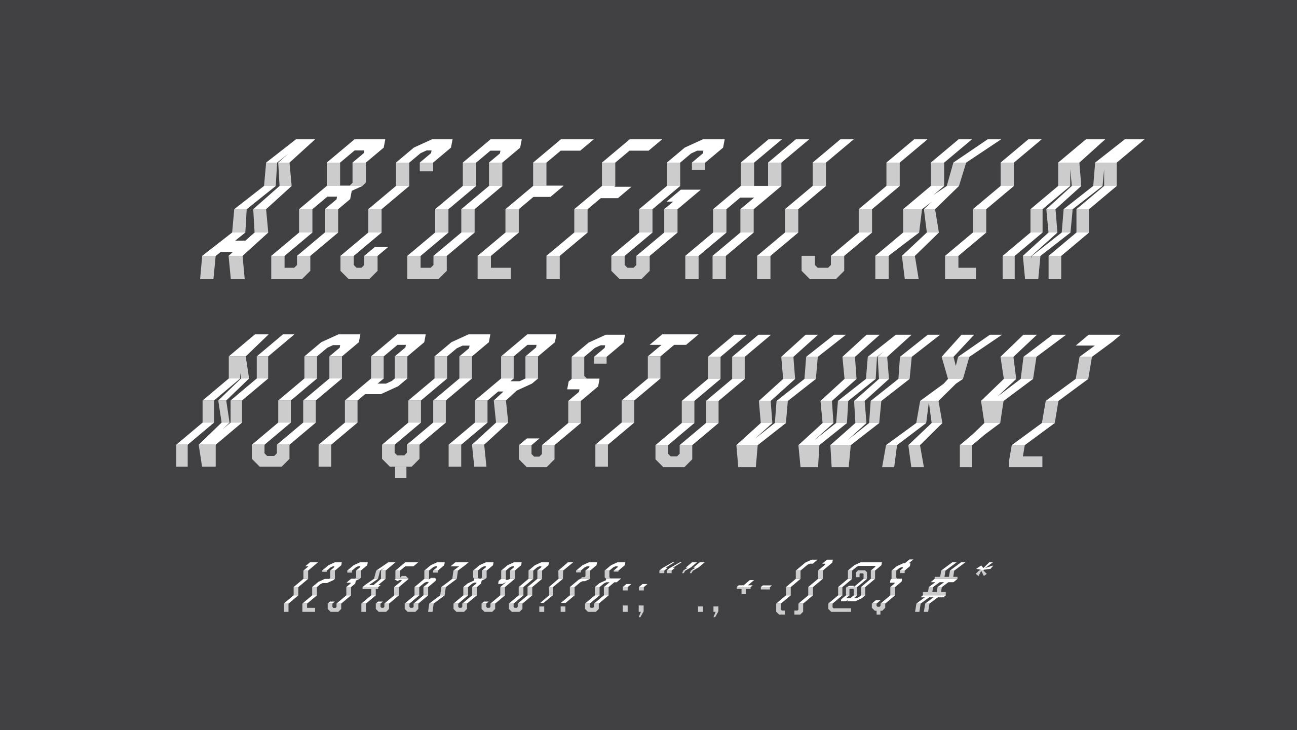
StopGap Foundation is making Toronto more accessible by building ramps for businesses with single-step entryways. But helping people understand how significant a barrier a single step can be is often challenging. “The Inaccessible Font” featured a custom typeface designed to be difficult to read. By slowing readers down and creating frustration, it mirrored the experience of someone living with a disability encountering a physical barrier. The font used hard-to-distinguish shapes, low-contrast colours and “ascending steps” instead of the typical straight or curved lines that make letters legible. StopGap identified several of Toronto’s 2,200 businesses with single-step entryways and mailed them letters printed using the font. Since the message was difficult to decipher, a QR code appeared next to a legible prompt directing recipients to a website with information on how to make their business accessible.
Credits
Camp JeffersonExecutive Creative Director: Julie Nikolic
Associate Creative Director, Art Director: Aaron Niven
Associate Creative Director, Writer: Dave Fontaine
Design Director: Leah Renihan
Type Designer: Aaron Niven
Producer: Lily Tran
Director of Delivery: Melanie Abbott